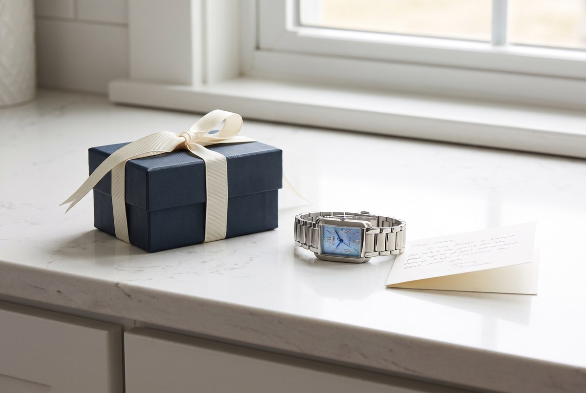
Ducci is not a discounter with a jewellery logo, and not a boutique performing luxury theatre. It is the third thing the market is missing: a knowledgeable dealer — authorized stock, dealer-honest pricing, and a human who knows the case.
Every design decision below serves that idea. Where fast-fashion jewellery sites shout, Ducci states. Where marketplaces bury the buyer in grids, Ducci curates a case. The brand should feel like the correspondence of a house that has nothing to prove — editorial, unhurried, precise.
A jeweller isn’t a warehouse with a checkout.
The existing lockup — the silver knot above a steel-blue Didone wordmark — is genuinely good, and it stays. The knot reads as both a Celtic love-knot and interlinked bracelet links; the elevation programme keeps the mark and upgrades everything around it.


Primary lockup — paper & light surfaces
Reversed lockup — midnight surfaces & photography
| Rule | Detail |
|---|---|
| Clear space | Minimum clear space = the height of the knot on all sides. Nothing enters it. |
| The knot alone | The knot may be used solo as a separator device, favicon, and pattern element at 20–28px. The wordmark is never used without intent at small sizes. |
| Never | No drop shadows, no gradients on the mark, no recolouring outside Ink / Steel / White, no stretching, no rotation. |
The palette is drawn from the mark itself — Ducci Steel #507890 is sampled directly from the wordmark — then extended with the materials of the trade: paper, bone, silver, champagne gold, midnight.
The discipline: steel and champagne are accents, never floods. Pages are paper and ink. Dark sections are midnight, reserved for moments of weight — the diamond cabinet, the discount-free trust panel, the footer.
Working tints — Steel Deep #3B5A70 (buttons, links) · Steel · Mist · Haze · Silver #C9CDD3 (hairlines on dark) · Stone #E2DFD8 (hairlines on light)
| Surface | Recipe |
|---|---|
| Default page | Paper canvas · Ink type · Stone hairlines · Steel links |
| Commerce moments | Steel Deep buttons (4px radius, tracked caps) · price in Ink, compare-at struck in Silver |
| Weight moments | Midnight ground · Paper type · Champagne for one number or one word — never both |
| Forbidden | Pure #FFF page grounds (paper only) · gradients · pastels · more than one champagne moment per view |
Two families, strict roles. Cormorant Garamond speaks — every headline, every price worth reading twice. Inter works — navigation, body, specification, legal. The signature contrast is a 10px tracked-caps eyebrow set against display serif at 8–10× its size.
Display — Cormorant Garamond 600 · used at 40–96px, line-height ≤ 1.05
Time, considered.
Editorial italic — Cormorant Garamond 500 italic · pull-quotes & captions of intent
Powered by any light. Never needs a battery.
Eyebrow — Inter 600 · 10–11px · letter-spacing 3px · uppercase · Steel
The Licensed Cabinet · 49 pieces
Body — Inter 400 · 15–16px/1.7 · Ink-body #3A4453 · max measure 640px
Authorized Bulova and Citizen Eco-Drive stock runs 30% under list here; Citizen Quartz and Caravelle, 25%. Not a coupon, not a countdown — the ledger price, every day.
Numerals — Cormorant Garamond 700 for hero figures · champagne or steel
25–30% UNDER MSRP · EVERY DAY
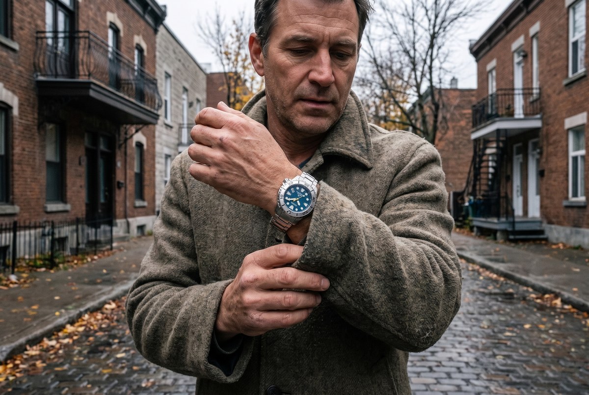
Two registers, never mixed in one frame: the catalogue (manufacturer-true packshots, generous whitespace) and the world (documentary lifestyle — Montréal light, honest hands, watches worn rather than staged).
Lifestyle frames are calibrated against three art-direction studies (below), each built from real Ducci stock. The direction: candid documentary framing, flat honest overcast light, true-to-life colour, product faithful to the reference — and a standing ban on the clichés of the category: red velvet, champagne flutes, tuxedos, black-marble “luxury” sets.
Quiet authority. Short declaratives, concrete specifics — model numbers, movement facts, real prices. No exclamation marks. Urgency only from facts. The reader is intelligent and busy; the house respects both.
“🔥 Don’t miss out on these STUNNING timepieces! Elevate your style with luxury watches at unbeatable prices — shop now before they’re gone!!”
“The Promaster has kept time on wrists that needed it to. Blue dial, ISO-spec dive lineage, $525 — 30% under list, because that is simply our price.”
“Hurry! Your cart expires in 02:59:14. Claim your exclusive VIP discount NOW.”
“Your selection is at the counter. No rush — and if a date matters, reply and we’ll tell you exactly what’s realistic.”
| Lexicon | |
|---|---|
| We say | the house · the case · the cabinet · authorized · considered · kept time · the ledger price |
| We never say | elevate · stunning · luxe · indulge · treat yourself · unbeatable · exclusive VIP |
| Surface | Status |
|---|---|
| Storefront | Hyper theme (FoxEcom 1.3.3) rebuild — see the accompanying theme render; every section maps to a stock Hyper section RevShift has shipped before on SRO. |
| Lifecycle system “The Ledger” — 10 flows, 26 templates, same tokens (paper/steel/champagne), Cormorant Garamond + Inter, knot separator as the series signature. | |
| Ads (PMax / YouTube) | Packshot register on paper grounds; steel eyebrow + serif headline lockups; no text on image assets per PMax spec. |
| Appointments | The differentiator. Every surface carries the human line: +1 (514) 831-8255 · by appointment, Mont-Royal. |